In browsing the customer support site, I have come to the conclusion that in most cases there will be one of two types of users.
- Users looking for information on how to use all the features of a coffee machine.
- Users who have a malfunctioning coffee machine and need to know how to fix it.
Problems and Suppositions
I browsed the customer support page for Nespresso’s Coffee Machines for both the use cases listed above.
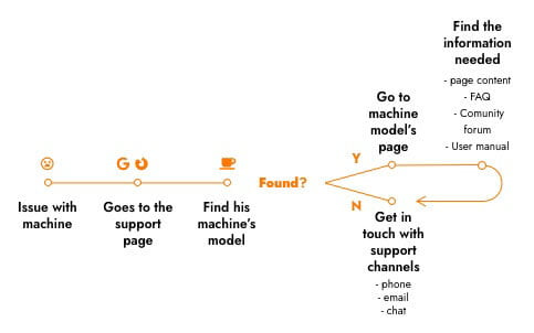
During the navigation, I built a list of problems encountered. I also made some suppositions, to be validated with a usability test. I compiled the steps in the user flow, which are presented in the image below.
Main page
PROBLEMS
- The order in which the machines appear doesn’t follow an obvious logic. Even variants of the same model are apart from each other.
- There are too many choices. The machines could be narrowed down to models first, and then, to variants of the model.
- The font size of the rest of the content is small.
- It’s not clear if the message “select your machine” refers to the text input or the images.
- There are a lot of images of the coffee machines, set in a grid of 4 x 5. In a laptop screen, as was my case, all are below the fold. And they push the rest of the content further down.
- Defective machines must go to the maintenance center. The support contact is only by phone, but this information is hidden.
SUPPOSITIONS
- The page lacks visual consistency with the rest of the site.
- Lack of consistency can lead users to think that the company doesn’t take as much care of customer support as the other areas.
- Better care in the implementation of the support area can boost customer trust and satisfaction, leading to higher customer retention.
The customer support page differs considerably from the other pages on Nespresso’s website
