What is a Customer Support page: The goal is to help the customers to get a better experience using the product. It increases customer fidelity and impacts how the brand is perceived.
What makes a Customer Support page good: All customer service channels must be in one place and be easy to access. Most users prefer to find the answers by themselves, leaving phone calls as the last resort option.
Benchmarking
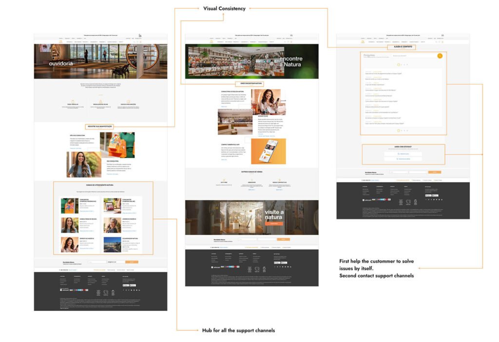
I used Natura’s customer support page as a reference. Natura’s customer support has been rated the best in the Brazilian market for two years in a row (IBRC EXAME ranking 2019). The company also shares the customer segment – Premium Segment – very similar to Nespresso, which makes the benchmark very useful.
Key takeaways
- Natura has a well-organized set of pages for customer support. They have a hub for all the support channels.
- The customer support pages maintain the visual consistency of the rest of the site.
- The contact and help page organizes the information so that the user can find what he is looking for on his own. The contact options come next.
Heuristics
During the heuristics analysis, I encountered some issues with the support page, listed bellow.
- Users often perceive aesthetically pleasing design as design that’s more usable. → The website lacks visual consistency and content organization. (Laws of UX)
- The time it takes to make a decision increases with the number and complexity of choices. → The website should show fewer variants of the same models. Arrange the coffee makers and their models hierarchically. (Laws of UX)
- Users spend most of their time on other sites. This means that users prefer your site to work the same way as all the other sites they already know. → Put a search bar at the top of every page. (Laws of UX)
- The minimum font size should be at least 16px. Some texts are in too small fonts. (Better Web Typography)
- The website should highlight the selected content tab, unselected tabs should be visible. It should connect the tab to the related content area, they all look and work the same. (nngroup)
- Line lengths for body text are generally between 40 and 60 characters. Areas with longer line lengths containing up to 120 characters need a higher line height, from 20sp to 24sp. (Understanding typography – Material Design)
