The purpose of this study was to redesign the existing customer support page for Nespresso’s Coffee Makers. The focus was on the web pages, without concerns about mobile devices.
nespresso-mockup
The Desing Process
For this case study I followed the steps bellow:
- Business Profile
- User Profile
- Use Cases
- Usability Test
- Benchmarking and Heuristics
- Competitive Analysis
- Hypothesis and Problem Statement
- Ideation and Wireframes
- Visual Design
- Results and Conclusion
Business Profile
I researched Nespresso's Brazilian business and the capsules coffee market in general. I read several articles and reports about the industry. The key points were:
- Nespresso is a key player in the market.
- Nespresso is facing increasing competition in the sector.
- The website is a major sales channel for the company.
- The company values its consumers and the experience of purchase, with exclusive stores and personalized services.
Sources (in Portuguese)
- Folha 2019 - Nestlé vai vender cápsulas de café com a marca Starbucks em supermercados
- Estado de Minas 2018 - Mercado de cafés em cápsula esfria e desafia empresas
- Veja 2018 - Consumo de café em cápsulas avança no país
User Profile
Premium Segment
The Brazilian Nespresso users are from the premium segment. Some data from the research:
- The segment looks for convenience and quality over price.
- Almost all the customers are from retail, around 95,2% in 2021. Coffee is consumed at home or work instead of in coffee shops.
- Almost half of the consumers are from the state of São Paulo (44,5%).
- Users try several channels to solve their problems. (Based on the complaints found on Facebook, Reclame Aqui, and in the company's forum).
- There is not a clear gender split.
Key takeaways
- Quality and convenience are essential.
- A and B economic classes.
- Retail consumers. Home and office consumption.
- All support channels must be visible.
Sources
- Estado de Minas 2018 - Mercado de cafés em cápsula esfria e desafia empresas
- Euromonitor Consulting - Tendências do Mercado de Cafés em 2017
- Rabobank - Coffee Pods Still Exciting Brazil’s Coffee Industry
Use Cases
In browsing the customer support site, I have come to the conclusion that in most cases there will be one of two types of users.
- Users looking for information on how to use all the features of a coffee machine.
- Users who have a malfunctioning coffee machine and need to know how to fix it.
Problems and Suppositions
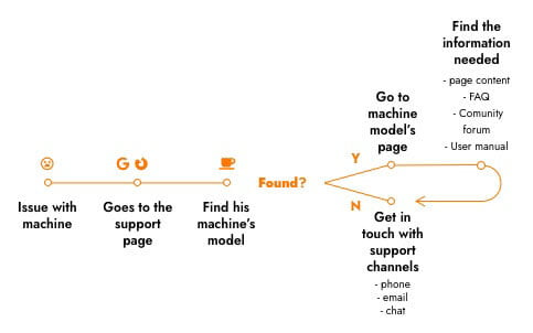
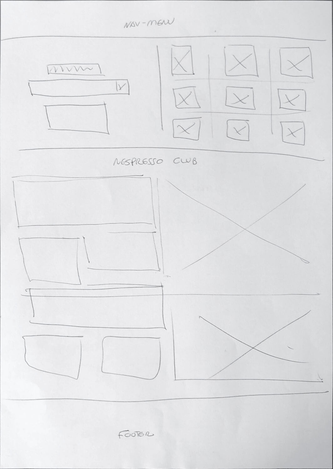
I browsed the customer support page for Nespresso's Coffee Machines for both the use cases listed above.
During the navigation, I built a list of problems encountered. I also made some suppositions, to be validated with a usability test. I compiled the steps in the user flow, which are presented in the image below.
User flow
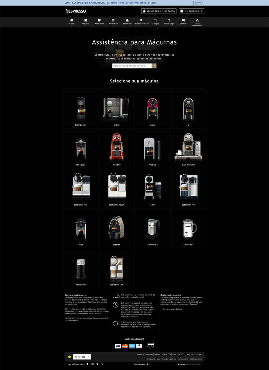
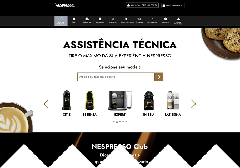
Main page
PROBLEMS
- The order in which the machines appear doesn't follow an obvious logic. Even variants of the same model are apart from each other.
- There are too many choices. The machines could be narrowed down to models first, and then, to variants of the model.
- The font size of the rest of the content is small.
- It's not clear if the message "select your machine" refers to the text input or the images.
- There are a lot of images of the coffee machines, set in a grid of 4 x 5. In a laptop screen, as was my case, all are below the fold. And they push the rest of the content further down.
- Defective machines must go to the maintenance center. The support contact is only by phone, but this information is hidden.
SUPPOSITIONS
- The page lacks visual consistency with the rest of the site.
- Lack of consistency can lead users to think that the company doesn't take as much care of customer support as the other areas.
- Better care in the implementation of the support area can boost customer trust and satisfaction, leading to higher customer retention.
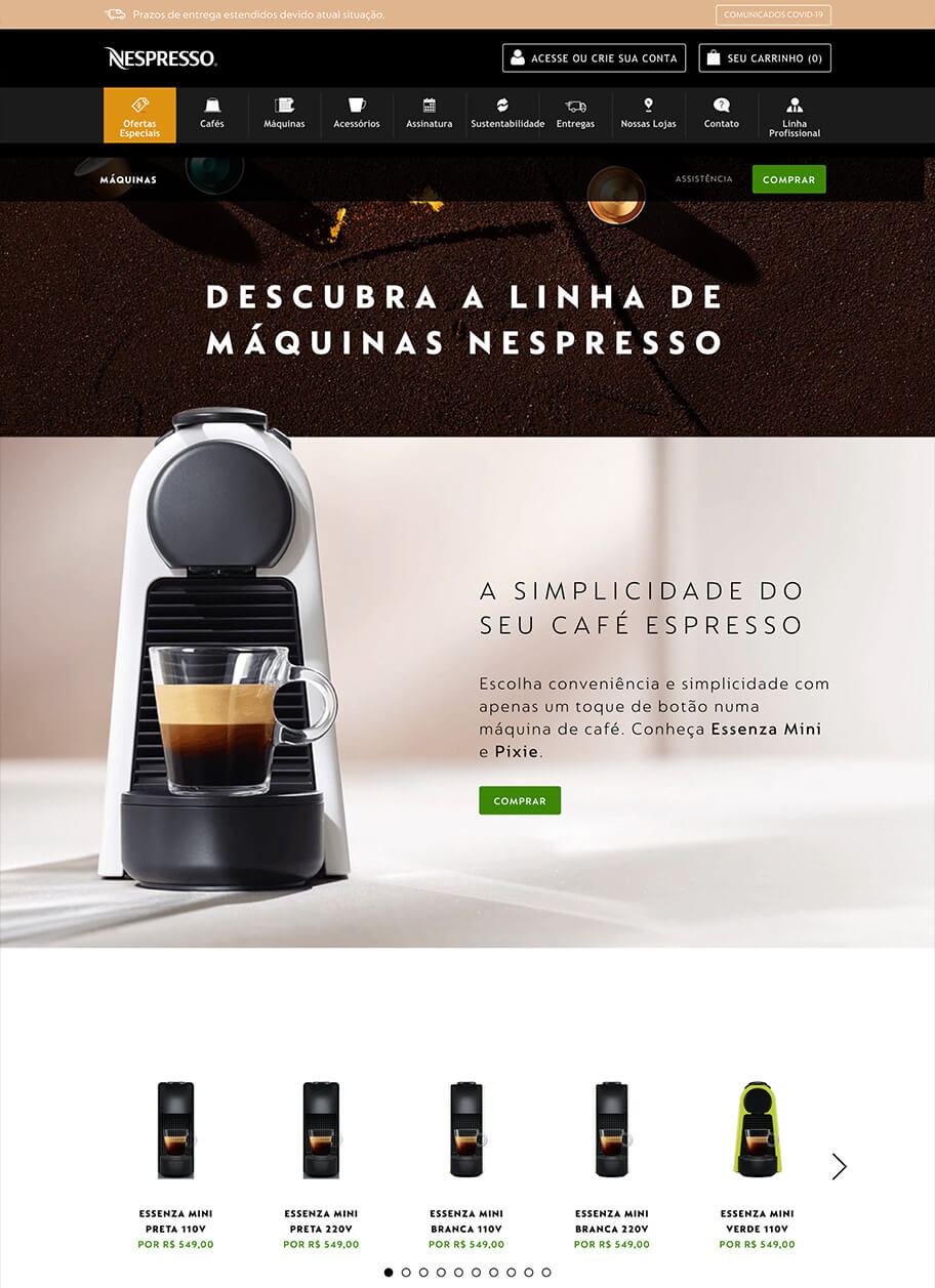
The customer support page differs considerably from the other pages on Nespresso's website
use-cases-images
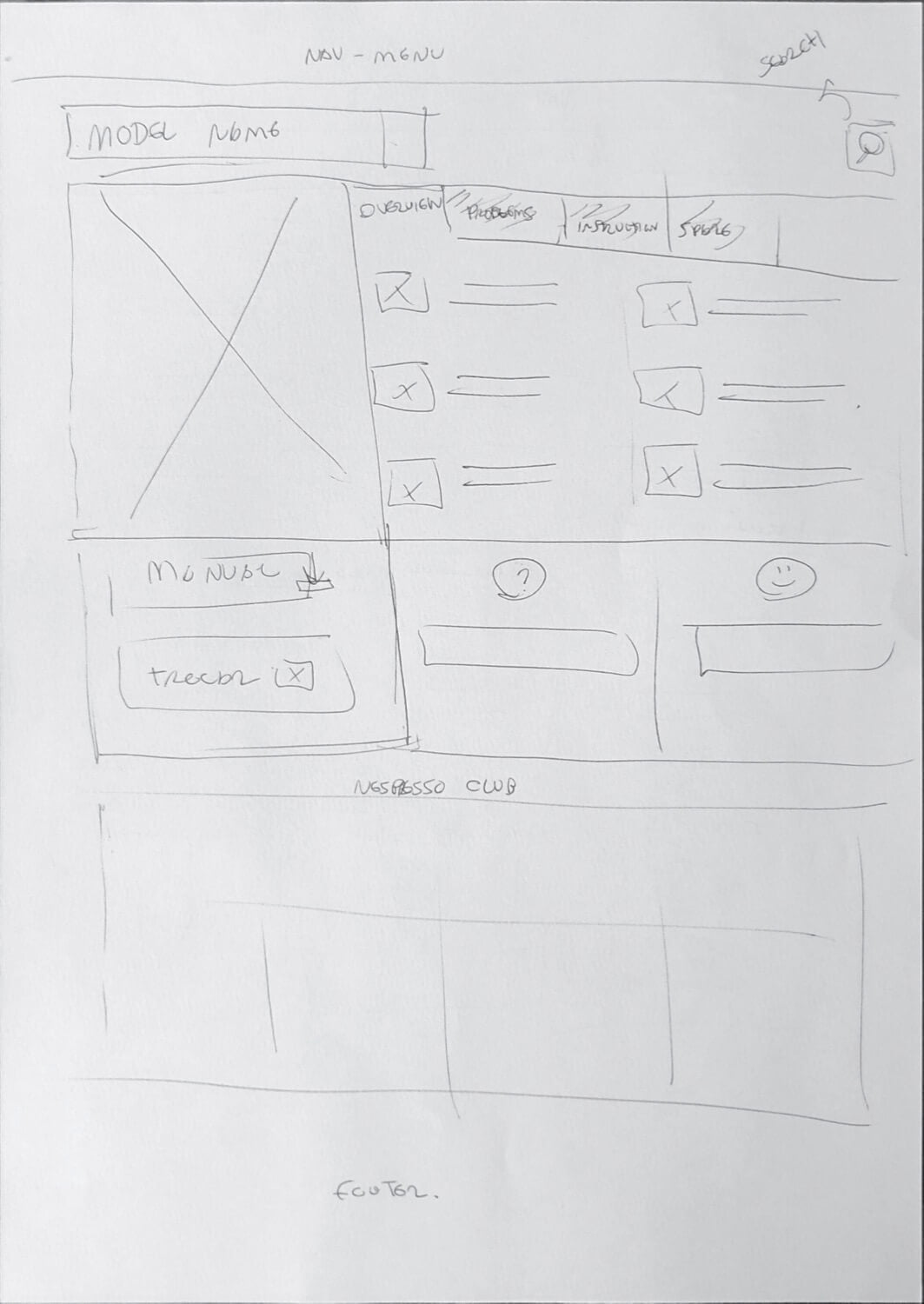
Coffee Machine Page
PROBLEMS
- The photo at the top is not always useful. The image should help the user confirms that the page is of his coffee machine's model.
- The tabs navigation should use a better visual representation. It is far from the content area it controls. The underscore that marks the selected tab is too subtle.
- There is a lack of consistency among the pages in the tabs menu, the order changes from page to page.
- The link back to the main page is small and subtle. The use of an arrow icon is confusing since it points to the right, but this link works as a "back" button most of the time.
- The manuals area should be in the same context as the other machine's information.
- The spare parts area text is too wide, using 146 characters.
- Confusion among the name of the support: Nespresso Club, Assistência Técnica, Assistência Nespresso.
Usability Testing
To have a better understanding of the problems with the actual page, I decided to do a usability test with two users. I selected two problems from the complaints I found on the Internet. For each problem, I built a document, with general information about the coffee machine, including a picture. With this document, the users could know a little better about the machine they need to search for information on the customer support page.
Tests
Task 01
Coffee Machine: Latissima touch
Your machine has a specific button for descaling. The descaling LED lights up. You go to the Nespresso site to understand why.
- Why should I descale my machine?
- How do I descale?
- Can I use the machine right after the descaling process?
- After descaling, the warning led does not go out. What should I do?
Task 02
Coffee Machine: Nissia
Your coffee maker has stopped working. You press all the buttons, but nothing happens.
- Can you find a solution to this problem on the customer support website?
Results
User 01
Don't like to "search" for things on the site. Would prefer to call a phone number, as soon as possible.
FINDINGS
- Found the phone and the machine's manuals.
- The user found the phone number in the content under the fold. Although other channels were cited, there aren't links to the chat and email. The phone number has a hover message, out of the context of the message.
- The user didn't see the information about the pickup of the machine at home, or the option to receive a temporary replacement while the machine is serviced.
- On the Inissia page, the user got confused with the two manual options. Apart from the file sizes, don't have any clear differentiation. The first option is for a manual with several languages. The second is only in English.
- The user got angry with the fact that the manual is in other languages and is hard to find the Portuguese chapter.
- The user got confused with several similar models to choose from on the support page. She choose the wrong machine, based on the photo and not on the name.
User 02
Like to search for an answer by herself. Usually, try all the other channels before having to call the phone number.
FINDINGS
- This user had problems with the search. First, she entered "Nespresso Inissia" and the filter didn't work. After, she entered Inissia, but the photos were almost all under the fold of the window and she didn't see the filter working. When she ended typing, she pressed Enter, but the site just reload the page, erasing the search input.
- The user didn't see the names of the machines. She tried to find it with the pictures, but the color of the machine in the file is different from the machine on the page. Took several tries to find the right model.
- Didn't like the Spare Parts section on the coffee machine's page. "I don't even know the problem with my machine and they are offering me spare parts already?"
- Liked the possibility to receive a machine while the other is serviced.
- Watched the videos about the coffee machines. Didn't like that they were in English.
- As the first user got frustrated by the fact that the message that cites the chat and email doesn't have the links to these services.
- Had difficulties finding the links to the manuals. Got puzzled by the two options as well. Also, didn't like the manual in other languages. It's hard to find the Portuguese section.
- Would like to have a search field to find the information she was looking for.
Benchmarking and Heuristics
What is a Customer Support page: The goal is to help the customers to get a better experience using the product. It increases customer fidelity and impacts how the brand is perceived.
What makes a Customer Support page good: All customer service channels must be in one place and be easy to access. Most users prefer to find the answers by themselves, leaving phone calls as the last resort option.
Benchmarking
I used Natura's customer support page as a reference. Natura's customer support has been rated the best in the Brazilian market for two years in a row (IBRC EXAME ranking 2019). The company also shares the customer segment - Premium Segment - very similar to Nespresso, which makes the benchmark very useful.

Key takeaways
- Natura has a well-organized set of pages for customer support. They have a hub for all the support channels.
- The customer support pages maintain the visual consistency of the rest of the site.
- The contact and help page organizes the information so that the user can find what he is looking for on his own. The contact options come next.
Heuristics
During the heuristics analysis, I encountered some issues with the support page, listed bellow.
- Users often perceive aesthetically pleasing design as design that’s more usable. → The website lacks visual consistency and content organization. (Laws of UX)
- The time it takes to make a decision increases with the number and complexity of choices. → The website should show fewer variants of the same models. Arrange the coffee makers and their models hierarchically. (Laws of UX)
- Users spend most of their time on other sites. This means that users prefer your site to work the same way as all the other sites they already know. → Put a search bar at the top of every page. (Laws of UX)
- The minimum font size should be at least 16px. Some texts are in too small fonts. (Better Web Typography)
- The website should highlight the selected content tab, unselected tabs should be visible. It should connect the tab to the related content area, they all look and work the same. (nngroup)
- Line lengths for body text are generally between 40 and 60 characters. Areas with longer line lengths containing up to 120 characters need a higher line height, from 20sp to 24sp. (Understanding typography - Material Design)
Competitive Analysis
In the Brazilian market, the main competitors of Nespresso coffee makers are Três Corações, Oster, Dolce Gusto, and De'Longhi. I visited each of their support pages to analyze how they compare to Nespresso's customer support.
Três Corações
- All the information is on a single page.
- It allows faster interaction with the user seeking to solve problems with his coffee machine.
- It implements a DIY approach, showing on the top the information that can help the user to solve the problem by itself.
- It keeps the same look and feel as the rest of the site.
- All the manuals and the videos are in Portuguese.
- The only information separated by the machine model is the quick manual.
- There isn't a way to see the title of the videos without clicking on each one.
De'Longhi
- Confusing support page.
- The videos are in English, and the manuals have several languages.
- On the bottom is the DIY info, with the FAQ search bar and icons for FAQ, Technical Assistance, Contact US and Manuals again.
- The icons are different from the ones presented at the top. As a whole, the page has problems with small fonts and a bad layout and information structure.
Dolce Gusto
- The Dolce Gusto page presents the coffee maker models with pictures in a grid.
- When the user selects a model they go to the coffee maker page which has the manual, warranty and FAQ options.
- The manuals are in Portuguese.
- They have an area at the bottom of the page that gives access to several customer channel options.
- The page uses a small font size.
- It maintains visual consistency with the rest of the site.
- The warranty and support are provided by another company, which manufactures the coffee maker, which hurts the consistency of the experience.
Oster
- It has a simple approach similar to Três Corações.
- It puts first the chat contact channel, the FAQ and Technical Assistance, and last the phone info.
- The look and feel keep with the rest of the site.
- Has fonts with an appropriate size.
Hypothesis
- I believe that making the user interface of the support pages more consistent with the pages of the rest of the website will improve the user's perception that Nespresso values the customer support process and after-sales.
- I believe that fixing the errors in the UI, accessibility, and Information architecture will improve the user's perception of the quality of the company.
- I believe that the use of a hub, with all support services and information, on every page will make it easier for the user to access critical information and solve problems.
Business side
- I believe that consistency in UI will improve brand value for Nespresso.
- I believe that fixing UI, Accessibility, and Information Architecture errors raise the number of users getting the information without needing direct contact, taking pressure off support channels that use human resources.
- I believe that a hub section highlights exclusive services, improving the perception of the quality and convenience of Nespresso products and services.
Problem Statement
The Nespresso brand is well known for its quality and convenience. But, the customer support web page has several problems that contradict the company's values.
In my opinion, the challenge is to offer the same level of quality on the customer support page as the user finds in the rest of the site and in the relationship channels with the company.
Statement
How can we make a support page reflecting Nespresso's quality and brand values because the current experience hurts the user's satisfaction and the perception of the company?
Ideation
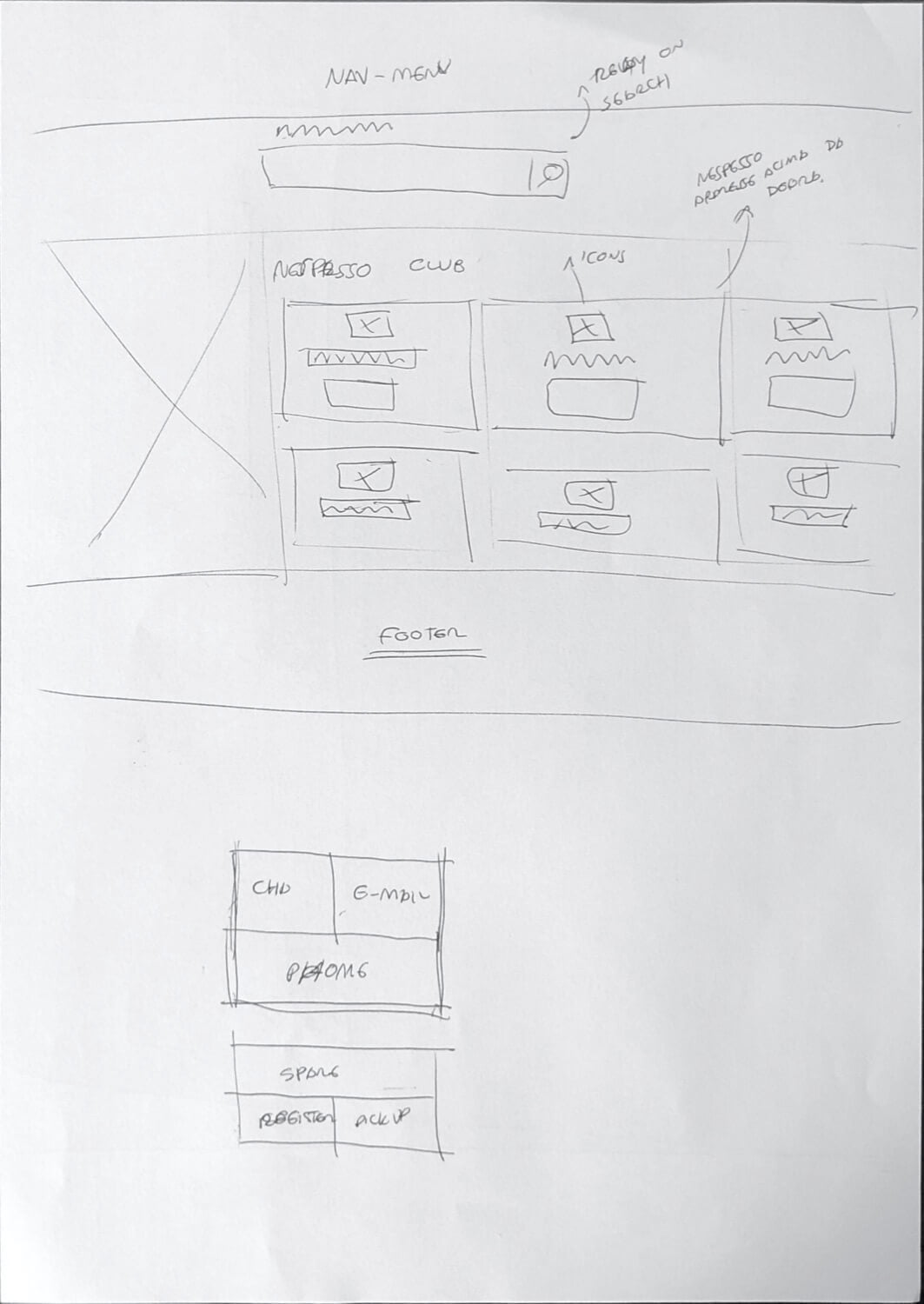
Sketches
Before I started brainstorming ideas, I defined the basic information architecture of the pages. In this way, I defined what information, and what hierarchy, would be on each page. Then I started to experiment, with pencil and paper, trying to find the best way to organize the content on the page.
sketches-mockups
Wireframes
Client Support Homepage
Quality
- Use of a hero image, keeping consistency with the website.
- Use of a carousel to show the models of the machines ( Consistency). It's the same component used on other pages.
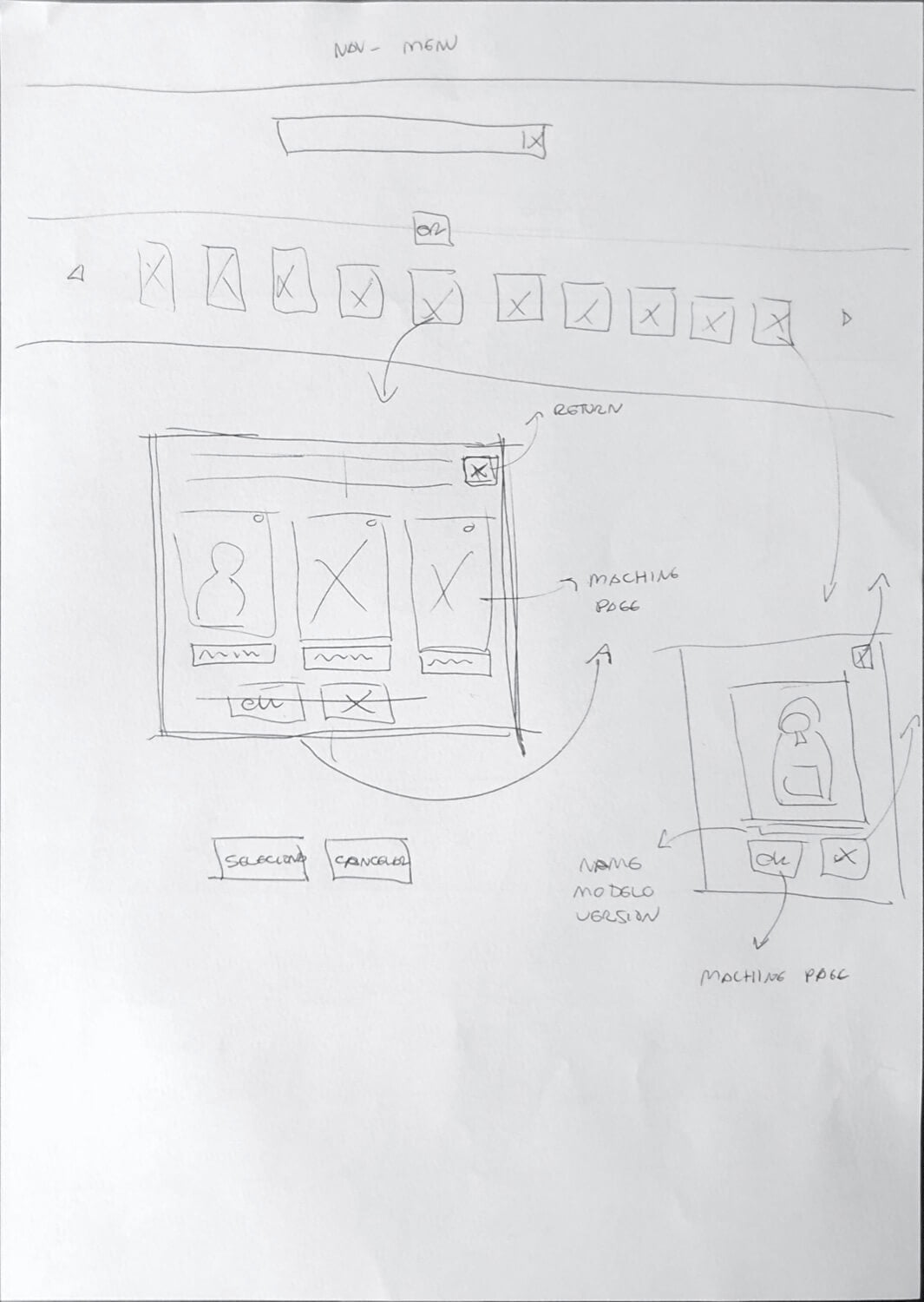
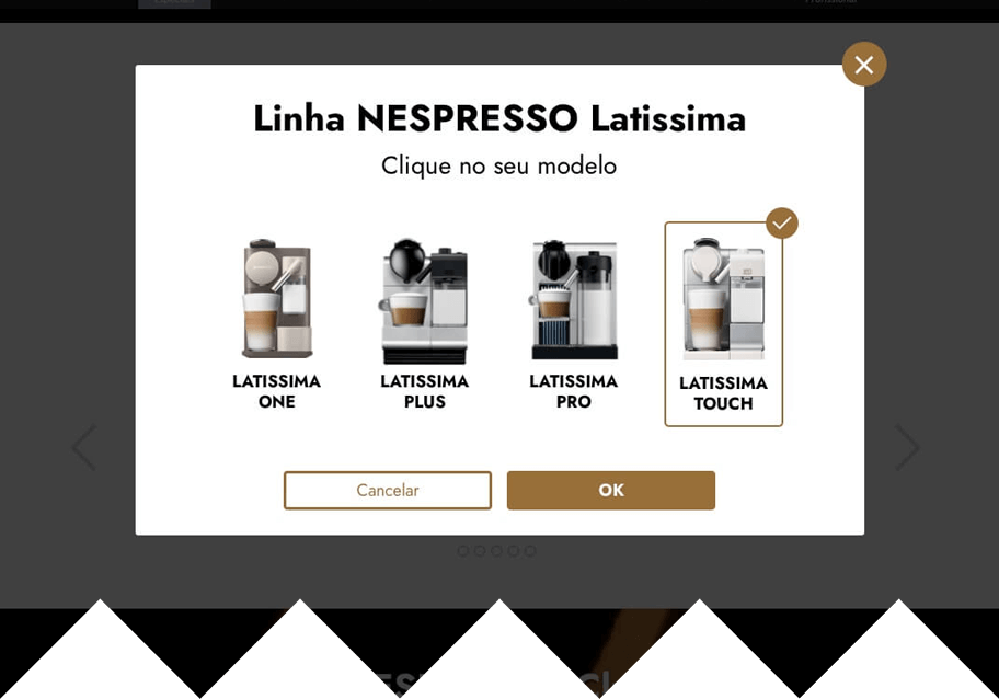
- When a machine has more than one model, when clicked, it opens a modal with all the options.
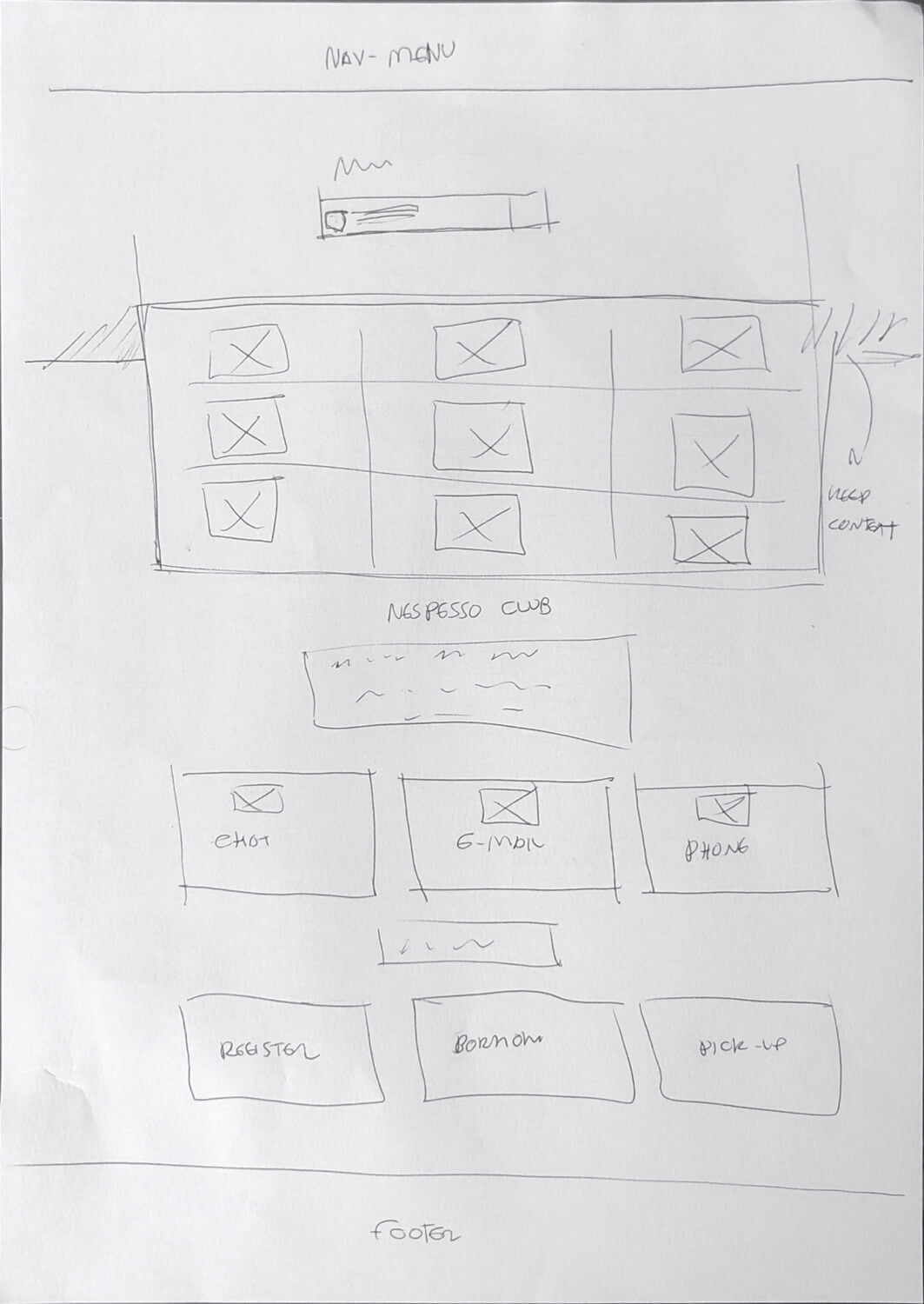
- Nespresso Club is what the hub section is called, a space where the user access all the customer support services.
Convenience
- The hierarchy of information splits into two main sections. The first is the How-to, aimed at the users that want to find the answers by themselves.
- The second section is for those users that didn't find the information or want to contact the company directly.
Customer Support homepage Wireframe

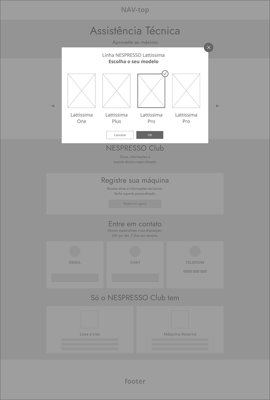
Modal open to select the machine model Wireframe
Coffee Machine Page inside the Customer Support
Quality
- I improved the tabbed navigation in the component that displays the coffee machine information.
Convenience
- The machine photo should be the main focal point. It helps the user to be sure that he is on the right page at the same time contributes to the overall vision of the page.
- Keep the Nespresso Club on all pages. The user can contact the company any moment he wants to.
Practicality
- All the information regarding the Coffee Machine is in the same visual context.
Coffee Machine page Wireframe
Visual Design
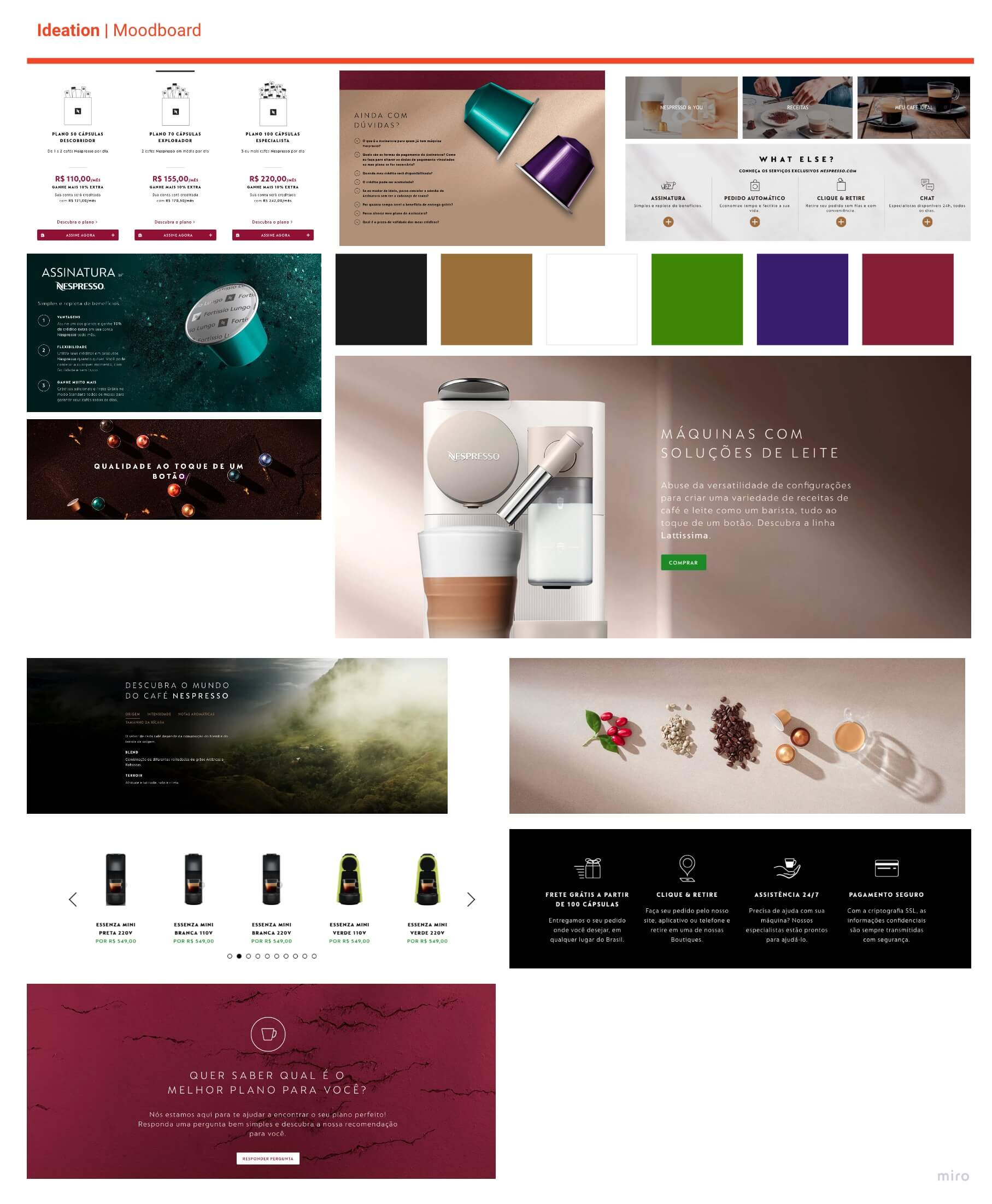
Moodboard
To guide the visual design, I built a reference framework to serve as a guide and maintain the visual consistency of the proposed solutions. The reference chart was made from images, colors, and visual identity as a whole from Nespresso's own website.
Visual Implementation
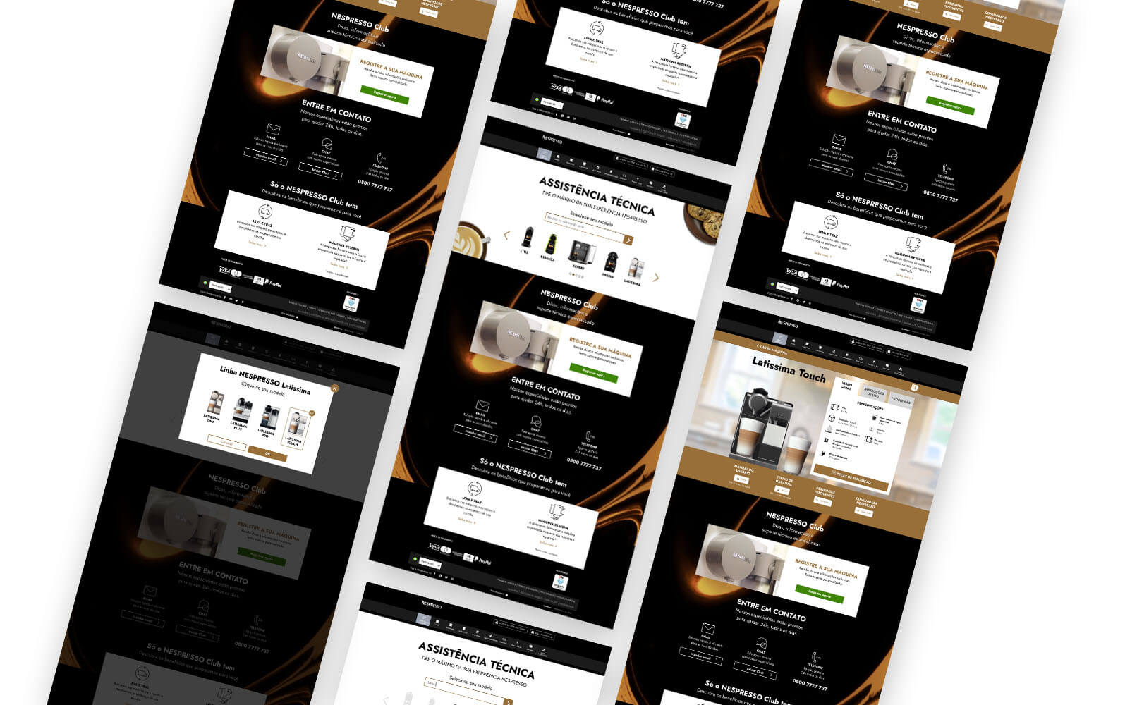
Based on the user flows and use cases presented, I built the graphical solution for two pages. The home page where the user has an idea of all the options of the support, and another page model to present specific information about each coffee maker.
For simplicity, I divided the presentation of the graphical solution into the two use cases defined above.
Section 1: Users search for the information
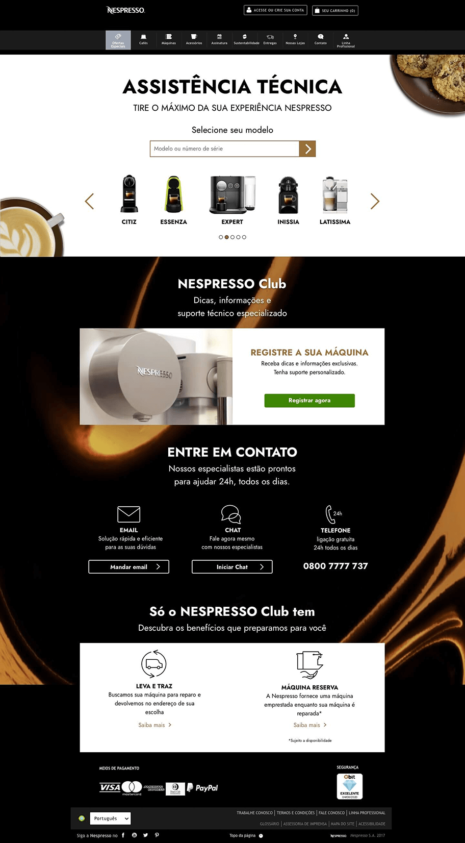
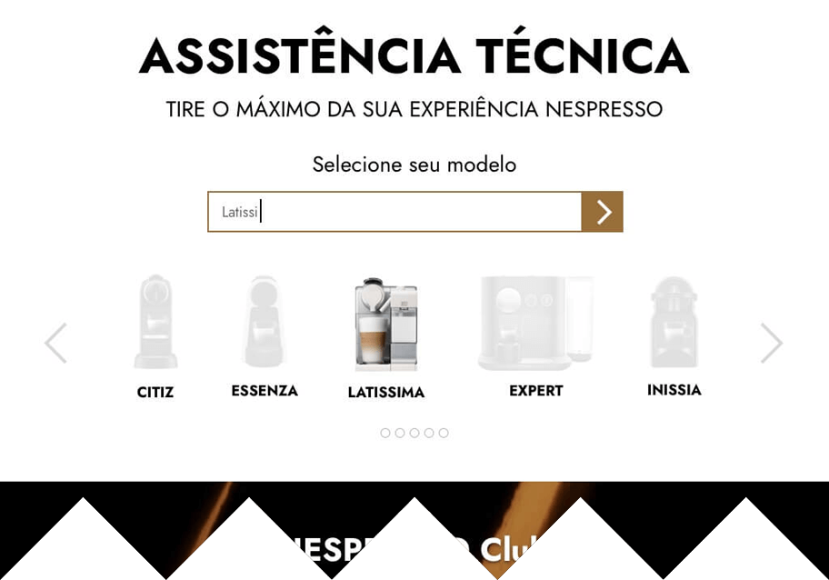
Coffee Machines Support Page
Screen 01
The top section is for users that want to find information about the machines themselves. The critical step for this user is to select the correct machine model. For this reason, most of the background is plain white to highlight the machine models for selection.
Screen 02
Once the user starts to write in the text input, the carrousel with the machine models should bring to the center the models that match the term and at the same time greys the others models.
Screen 03
When a coffee maker has more than one model, a modal (pop-up) shows the options for the user choose from.
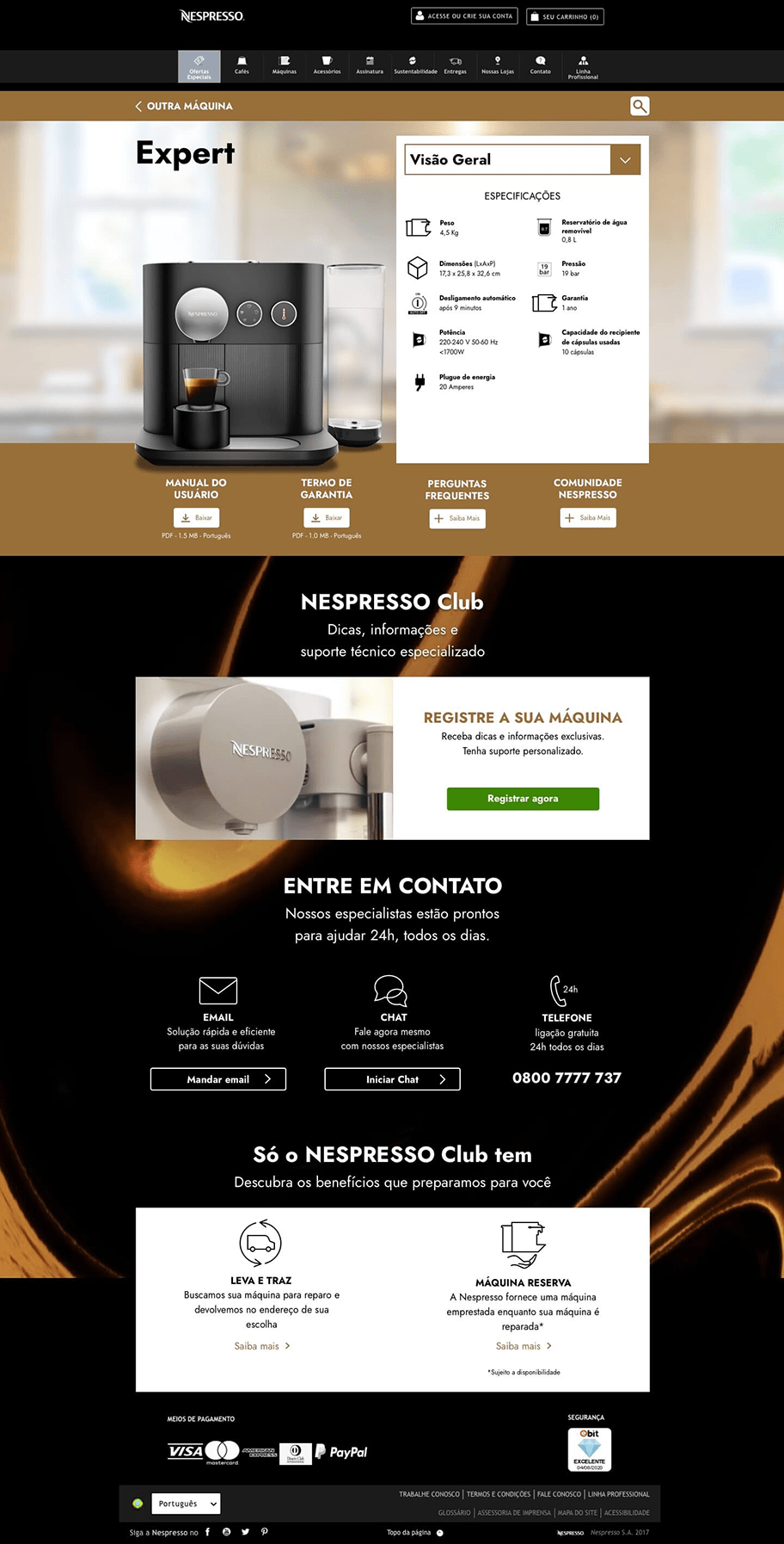
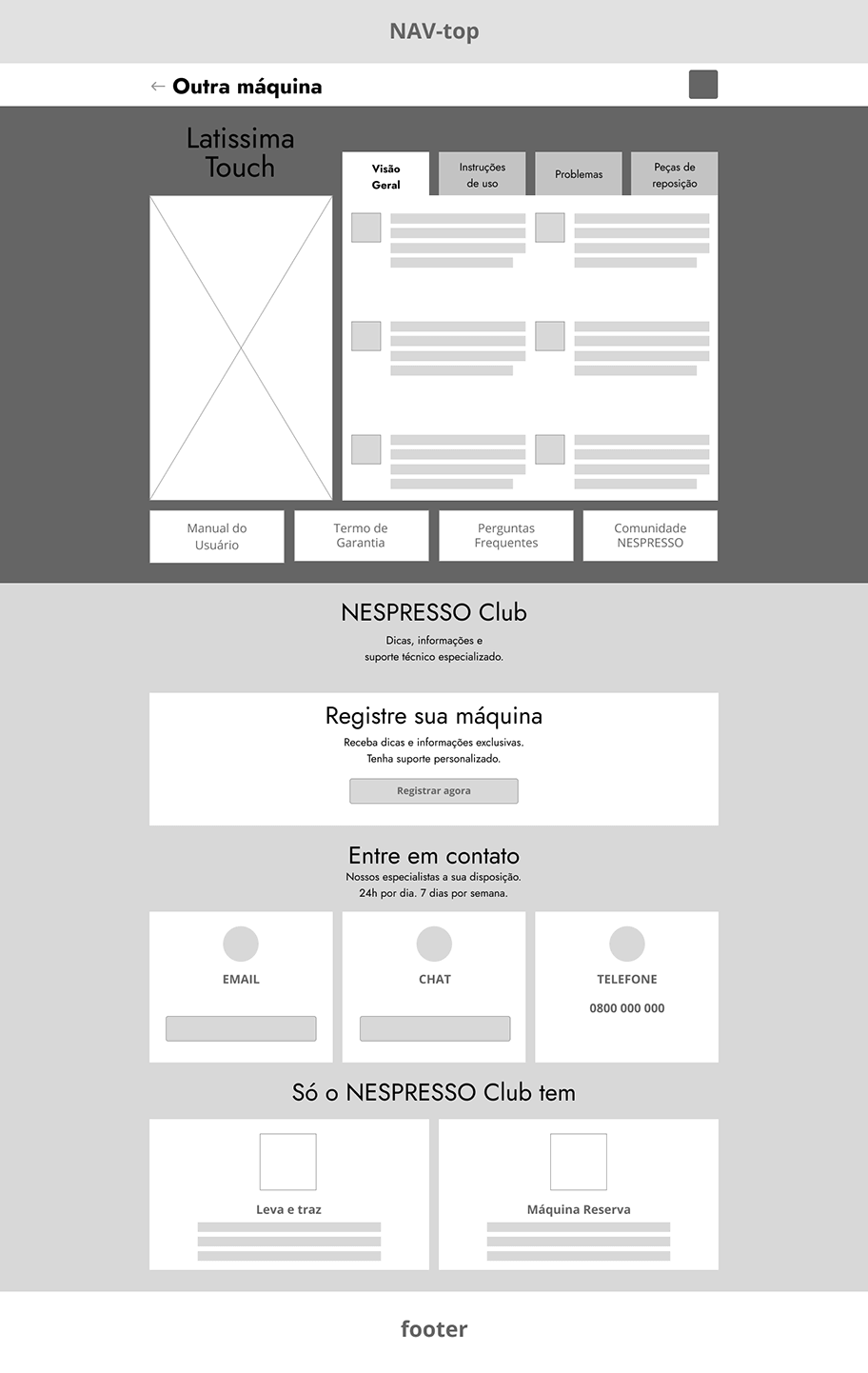
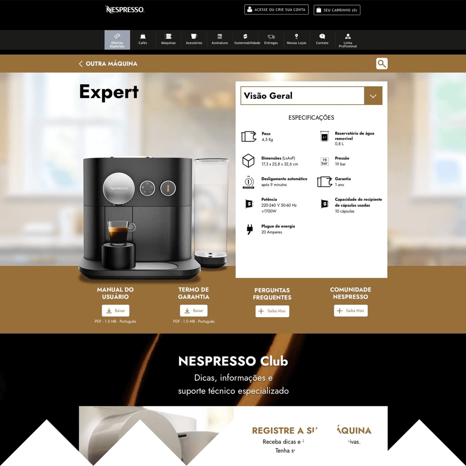
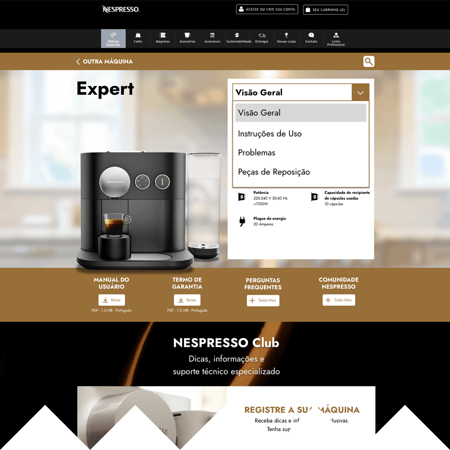
Coffee Machine Page
Screen 04
The coffee maker page has two sections. The top part has general information about the machine, while the second has specific information. The photo is highlighted so that the user can confirm that it is their model.
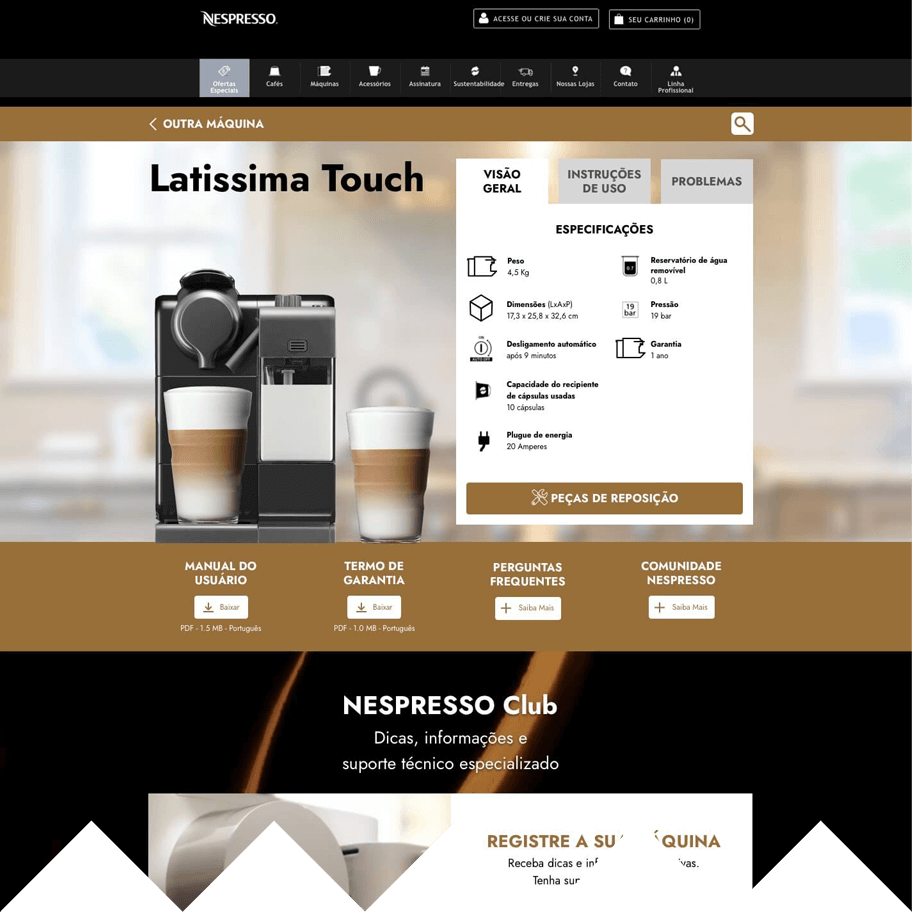
Changing the navigation method
Screen 05
To make more room for a wide coffee maker picture, I changed the navigation on the component containing the machine information from tabs to a drop-down menu.
Screen 05a
The drop-down menu is more flexible, as it can show more items within the same layout structure. Thus, navigation is not restricted to just three items.
Section 2: Users wanting to contact the customer support channels
Screen 6
The customer support contact channel information is in a single space, called Nespresso Club. This area also has information about machine registration and exclusive services for Nespresso customers. This section is displayed on every support page, the customer can access it at any time.

Results and conclusion
The solution addresses the issues presented in the problem statement and the research. The design keeps the same visual experience as the rest of the website, using the same colors and components. It improves the experience, making it easy to find information about the coffee machines and locate the customer support channels.
Further opportunities
A step to improve the experience would be to investigate how to improve the integration of technical support with the other website's pages. In the present solution, customer support is isolated from the rest of the website, in its section. An assumption that I have is that could be possible to insert relevant information about the machines and the support service into the buying process, to boost confidence and decrease the number of contacts with the customer support lines.