Enabling life change

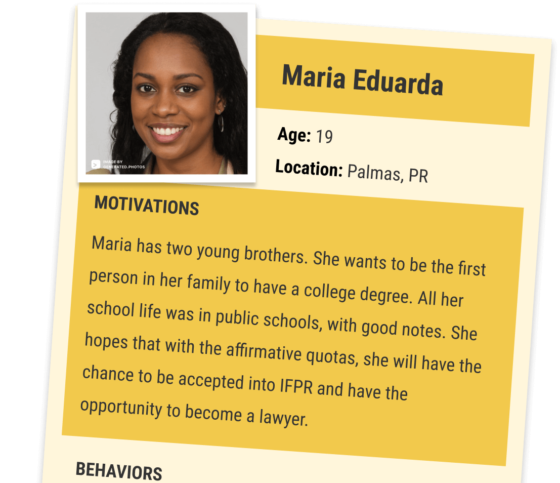
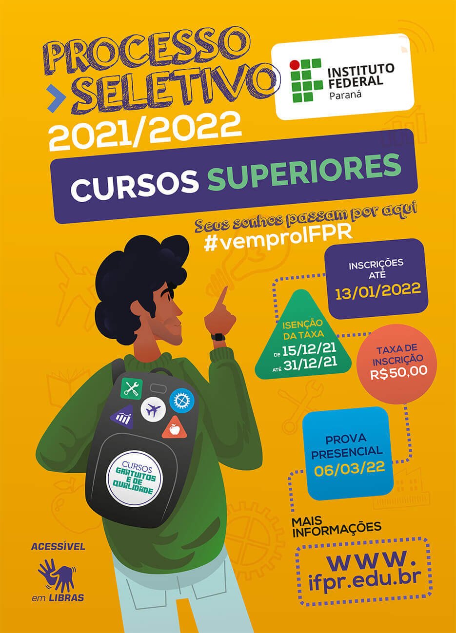
Yearly, thousands of students compete to get into one of the best Brazilian public and free schools, IFPR. The chance to study there is life-changing for many low-income families.

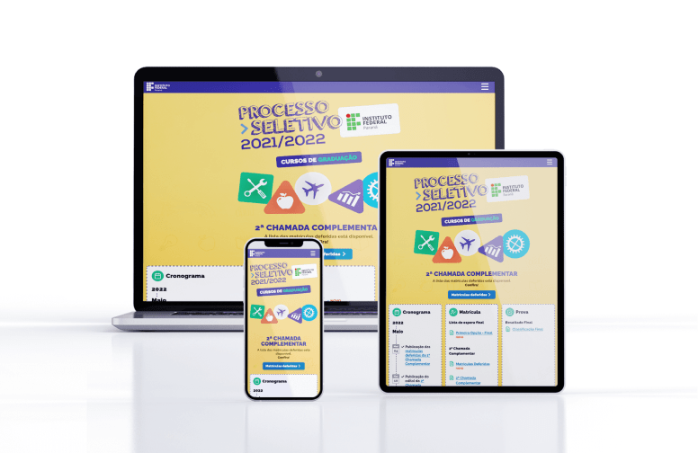
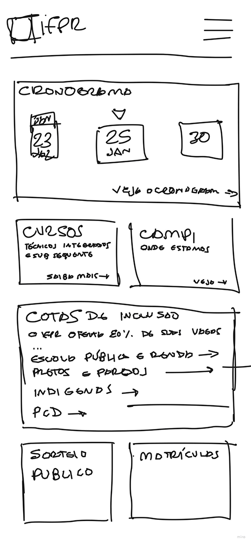
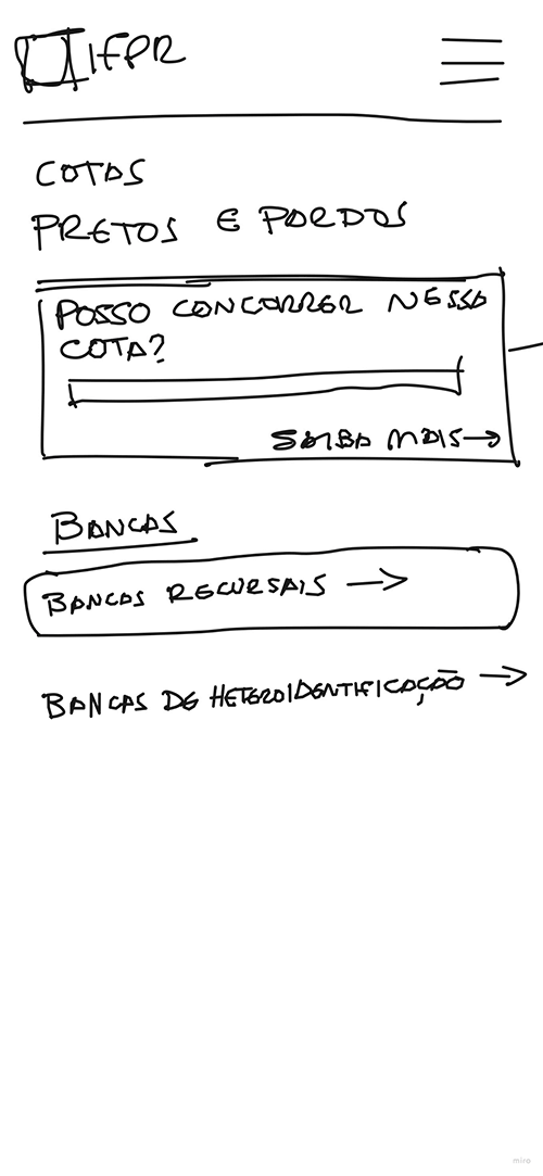
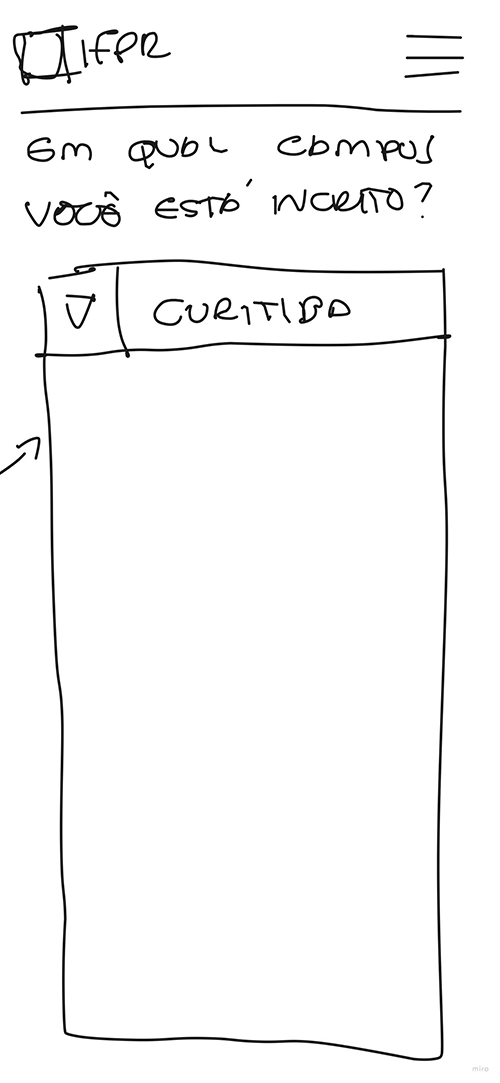
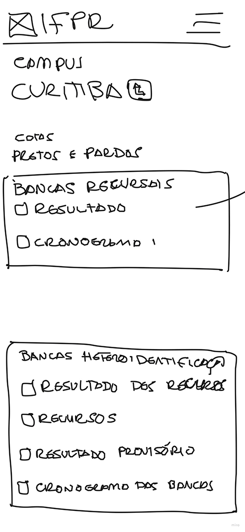
IFPR needed a website for the student’s admission process that was more efficient, accessible, and easy to use, helping the candidates to focus on what matters: getting selected for the following year’s courses.

Mockup

Mockup showing the IFPR's website on three different devices: A laptop, a tablet and a phone

The Design Process

  • Research and Discovery
  • Definition
  • Visual Design
  • Testing
  • Development

Before acting on the project, I needed approval from the committee responsible for running the admission process. To them, I had to advocate a human-centered design approach and present the steps we would follow to develop the website project.

I got the approval, but with a caveat: I had six weeks to do the entire project and deliver the product in time for the beginning of the admission process.

My Roles

  • Ux Research (secondary and desk research)
  • Ux Design
    • User flow
    • Ideation
    • Wireframes
    • Prototype (Adobe XD)
  • Development
    • Frontend (HMTL, CSS, PHP, Jscript, JSON)

Looking at the data

Since we already had a previous website, I started looking at it for improvement opportunities. My data sources were google analytics, the support contacts, and the economic and social questionary all candidates had to answer in the previous year.

I also spoke with people from IFPR that knew someone that made the process last year to get their feedback.

Screenshot of the previous version of the website
Previous version of the website

User Feedback

The main problems noted in the support data and the talks with colleagues and users were:

  • The calendar was confusing, and users had difficulty finding passed dates.
  • Some publications and results were too long and hard to filter and find the information.
  • The results from several phases got mixed. The candidates got confused about where they would find the information they needed at a given time.
  • Most of the phase's results reports used pdf files, usually in large sizes.
  • The results were made available in one file with the data from all candidates. The candidates must sort their names from a lengthy list.

Proto Persona

From the last year's questionaries and Google Analytics, we had a good amount of quantitative data that allowed the construction of a target user profile. 

RELEVANT DATA

  • 64% of the candidates access the website with mobile devices, most low-end models.
  • The age ranges mostly from 15 to 25 years old.
  • 75% of the candidates are from low-income households.
  • 36% are black.

Defining the foundantion

Site Map

Since this project is a new iteration of an existing product, I started revising the site map to see if there were any opportunities for improvement in the information architecture.

Here are the changes I made:

  • Added a page for the calendar with all the scheduled dates of the process. The candidates can see the dates without other information in the way.
  • Split the General information page into Notices and Announcements, Enrollment, and Campuses. The labels are more direct, and the information is easier to find.

Task Flows

One of the problems users related to using the previous version was getting lost while searching for the information they needed.

To address this, I went through all the task flows, examining how to make each one more straightforward and intuitive.

Task Flow Images

An illustration of the flow of the task enroll in the admission process
An illustration of the flow of the task see the result of the enrollment
An illustration of the flow of the task see the list of the enrolled candidates

Wireframe sketchs

I used Miro to have all the information on one big whiteboard. Using my iPad, I sketched the ideas for each website screen and explored how the user flow would work.

wireframes-images

wireframe illustration

Reshaping the User Interface

I changed the interface structure and how it works. The intention was to address the problem the users had to find information after the first stages of the process.

scheme of the previous website
The old version had three main, fixed sections: a hero with a call to action, a left-side menu, and the content area.
scheme of the new website
The new version kept the hero but added cards that show the topic most relevant information to each phase.
illustration showing that the content can be updated inside the widgets
Each card work as a widget. It shows the topic's most relevant information at each phase of the process.
scheme of the organization of the cards
We can reorder the cards to emphasize the most prominent subject at a given time.
illustration of the calendar showing the word date repeated several times
The calendar widget shows the last passed date and at least the next three. It also has a link to a page with all the schedules.
scheme of the menu panel appearing over the rest of the content
The menu went under a hamburger icon as secondary navigation. The user can navigate the website without needing the menu.

Visual Design

I built the visual design on Adobe XD and Adobe Illustrator. It was an adaptation of the design and branding from the marketing campaign.

Style Guides

I defined the color palette and typeface based on the marketing branding. The Style Guide is direct and concise. I was the only person working on the project, so I could make adaptations on the fly while building the prototype or writing the code.

poster of the champaing shows a illustration of a boy, view from his back, wearing a backpack and pointing to the top, where is written  the information about the process
The poster part of the marketing campaign developed by IFPR's comunication department

style guides images

Typography

typographic styles and scale

Colors

all the colors used in the website with the reference codes in hex

Icons

icons used in the website

Illustrations

Sample of the several illustrations used in the website

Prototyping and testing

Based on the site map, task flows, and wireframes, I built the interfaces on Adobe XD. The next step was to make a functional prototype and test it with users.

I tested the main tasks the candidates would have to perform. The tests showed that we were in the right direction. I had only a few adjustments to make.

Developing

Working in all the project's phases allowed me to see how coding can heavily impact the experience.

In this case, usability is severely affected by low-speed access and computational power. Thus, the website needs to be lean and lightweight.

I built a responsive website using HTML, CSS, PHP, and JavaScript. I used JSON files as a repository for the data. I Didn't use any frameworks or other libraries that could add to the weight.

A negative impact of the older versions was the use of PDFs. I implemented a way to present the information in HTML, filtering the results to show only relevant data to the user.
In the end, the size was reduced from 85,1MB to 19,3 MB compared to the last version.

Development goals

  • Responsive
  • Lightweight
  • Efficient

Efficiency gains

In the end, the overall website size was reduced from 85,1 MB to 19,3 MB compared to the last version.

bars graphic showing a decrease of 4x in the size of the website

Results

The website was made available to the public on December 15th, 2021. On May 17th, 2022, at the end of the process, it had received 58 thousand users, 38% more than the 42 thousand of the previous version.

The number of views rose from 367 thousand to 703 thousand, 91,5% more. The engagement time grew from 2 minutes and 23 seconds to 3 minutes and 40 seconds, a growth of 54%.

results-graphics

Users

graphic showing 40% growth in users visits

Views

graphic showing 91% growth in visits

Engagement

graphic showing 54% grow in user engagement

User Behavior

The user's behavior also improved. The visits peaked at the start of each phase. It indicates that the users kept returning and using the website during the admission process. In the last version, the user's engagement fell more sharply.

It's important to note that the number of contacts to our support fell noticeably. Therefore, the website achieved its goal of helping the candidates of the IFPR's admission process, being more accessible, handy, and easy to use.

Previous version

google analytics graphic of the previous website. There is a sharp drop in users visits after the first phase
In the previous version, less users returned at each phase

New version

google analytics graphic showing that users returned more and expended more time in the website
The new version has more returning users at each phase, and they visit more often during each phase

Improvements opportunities

  • Enhance the filters to show only campuses with results in a given phase.
  • The course's enrollment phase presented most of the problems with the users. More research is needed as well as a better task flow.
  • Research methods to show results that take less space in the tables (e.g., build a legend with repetitive terms).
  • Speak with the stakeholders about the importance of having more time to research.