Reditec sul 2022

Reditec Sul – Meeting of the Directors of Federal Institutes of Education, Science, and Technology of the Southern Region – is an event that brings together deans, pro-rectors, and directors of the Federal Institutes of the southern region of Brazil.

For the 2022 edition, I led the construction of a website that centralized the event’s information and allowed participants to have an easier and more practical experience, boosting the event’s results.

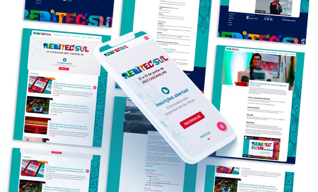
reditec-mockup

Illustration of a cell phone showing the home page of the site and in the background several screens of other pages of the site

Stages of the Project

  • Institutional Objectives
  • User Profile
  • Competitive Analysis
  • Design Challenge
  • Ideation
  • Graphic Design
  • Prototyping and Testing
  • Results

What I did

  • UX Design
    • Discovery and Definitions
    • Prototyping and Testing
    • UI
  • Development
    • Building the responsive theme for Wordpress
  • Team and project management

Institutional Objectives

To meet the objectives set by the event organizer, the site needed to meet the following points:

  • To be the only place to gather all the information about the event.
  • To allow the journalists responsible for covering the event to edit and publish news, photos, and videos.
  • To provide access to the registration system and the issuing of certificates of participation.
  • To store and provide access to the files of the speakers' presentations.
  • To store and make available the photos of the coverage of the event.

Deadline

From conception to final product, the project had to be done in less than 40 days.

User Profile

Since we knew who all the possible participants of the event would be, it was possible to precisely define the profile of the users. All users are part of the group of people who hold management positions within the institutions. They have access to quality internet and would access the site both on their desktop, while in the office, and on their cell phone, while on the move. They are users who value the good use of time and the agility and ease in solving tasks. Based on this profile, the team listed important features to be implemented in the final product:

  • Registration process should be simple and fast.
  • The most important information should be clearly available.
  • Information about hotels and lodging should be available.
  • Information about distances and commuting between the event and the nearest airports.
  • Easy access to the certificate of participation, used as proof of attendance to meet legal requirements.
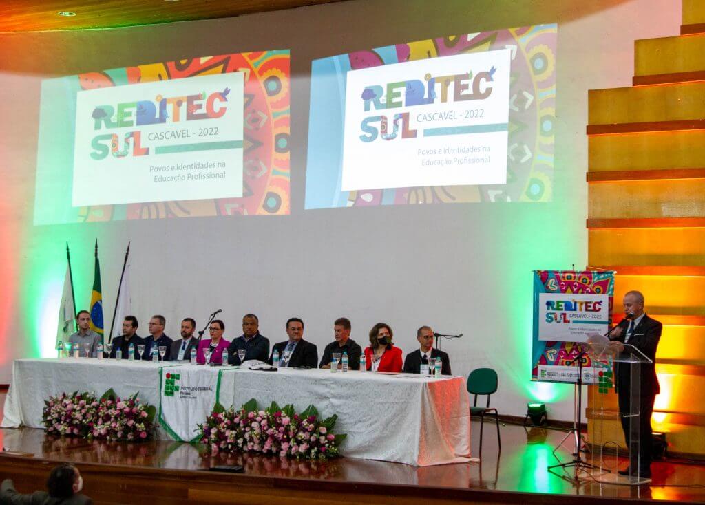
Photo of the event showing the table of authorities during the opening
Leaders of the institutions at Reditec Sul 2022

Competitive Analysis

In order to establish a basis for comparison and gather information about similar experiences to the product we were building, we analyzed the website of the previous edition of Reditec Sul and of the national Reditec, which brings together leaders from all over Brazil. All the websites can be classified as a microsite, that is, small specific websites for the event in question. The websites work in an isolated way from the institutional websites. The graphic design is strongly related to the brand and visual identity of the event. The functionalities are generally the same as we listed during the construction of the user profile. 

Functionalities found in the sites evaluated

URLLink to registrationNewsAccommodation informationTransportation informationFile Sharing
http://reditecsul.iffarroupilha.edu.brYesYesNoNoNo
https://www.reditec.ifb.edu.brYesYesNoNoNo
https://reditec.ifsc.edu.brYesYesYesYesYes
http://2022.reditec.org.brYesYesNoNoNo
Presence of the main functionalities in the visited websites

Design Challenge

The value proposition of the Reditec Sul website for the user is to provide efficiency and simplicity in the processes related to the event, such as registration, programming, information about transportation and accommodation, access to presentation files and issuing of certificates, among others. It is important to emphasize that an efficient experience in the activities related to the event impacts the participants and their institutions. Simple and fast processes mean more time for them to dedicate to their main activities.

Regarding the institution, the value proposition is the perception of the institution itself, reflected in the organization and professionalism in the construction of the site and the event. The news coverage play a fundamental role in this perception of value.

Based on these values, our design challenge for the Reditec Sul website was:

How to create a website that makes the information and services related to Reditec Sul available, in a simple and efficient way, because this has a positive impact on users and their institutions?

Ideation

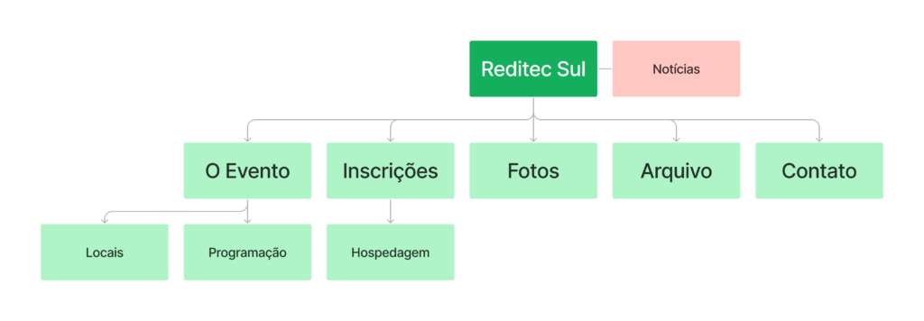
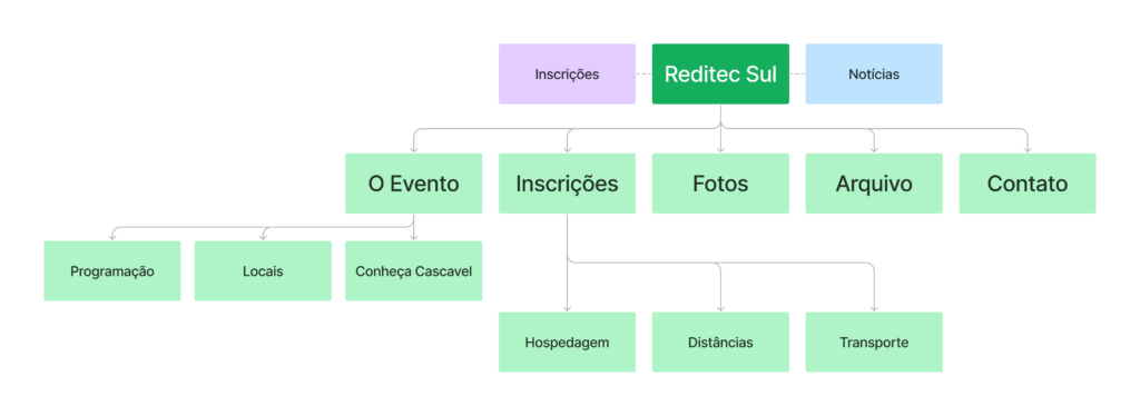
Prior to the process of generating alternatives, we established the basic information architecture using a sitemap. We built the map collaboratively using Google's Jamboard. The initial sitemap was changed after the results of the usability test and institutional demands. The changes can be seen in the following images.

Initial version of sitemap
First version of the sitemap
Final version of the sitemap
Final version of the sitemap after the usability test and institutional demands

Sketches and Wireframes

The ideation process was done using Miro on Ipad. First sketching with a pen and then building wireframes of the pages, to explore the user flows and the layout of the elements on the page. With then we arrived at the layout of the elements that we believe would allow the best experience according to the functionality raised in the previous phases of the project.

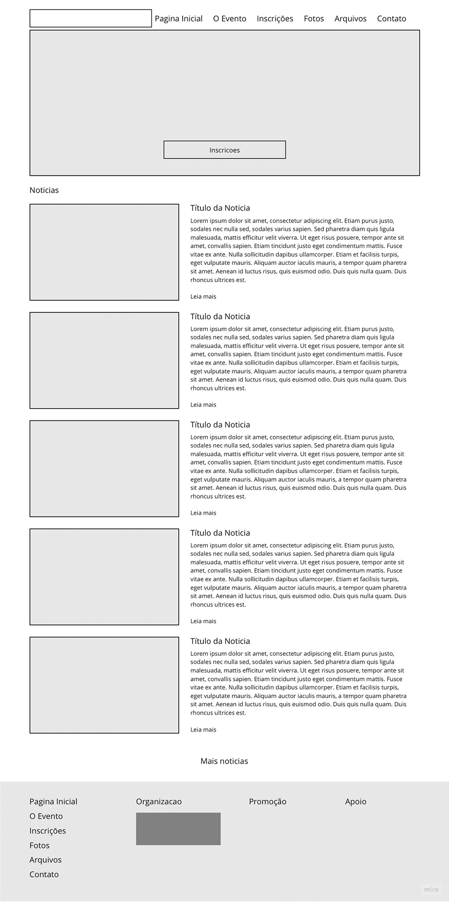
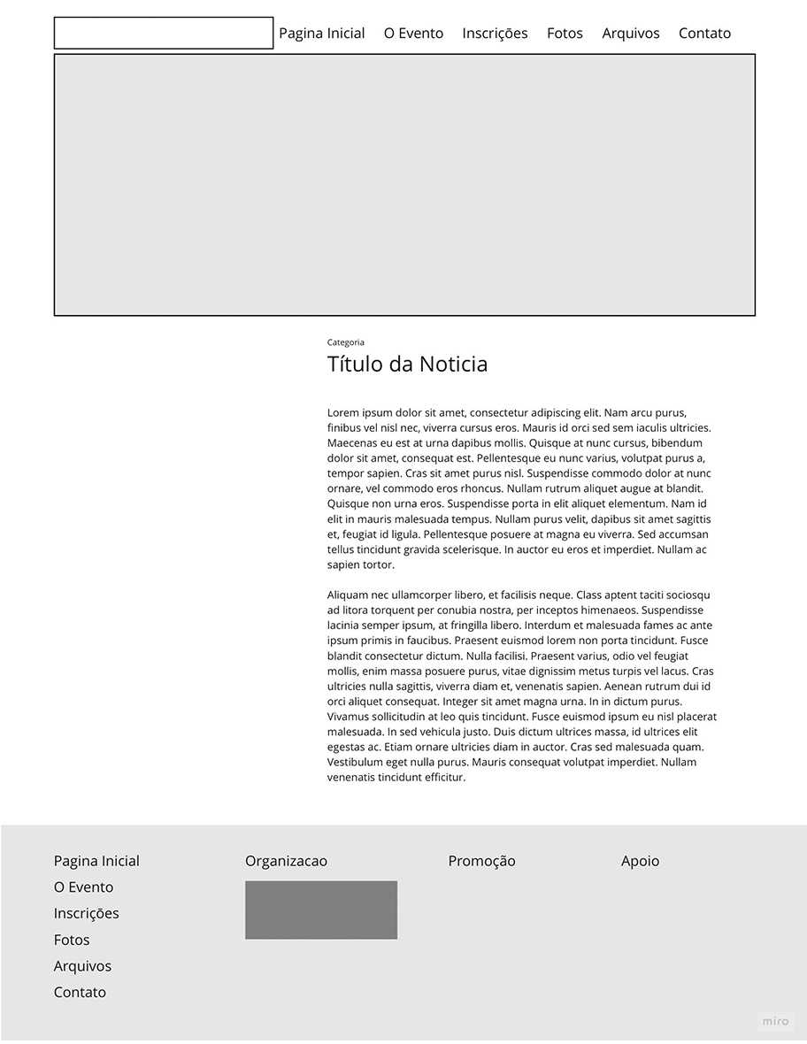
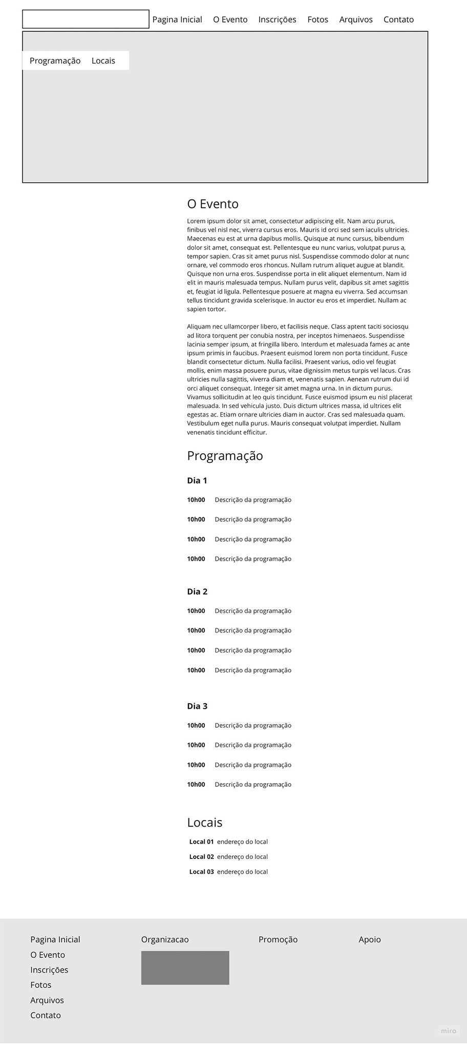
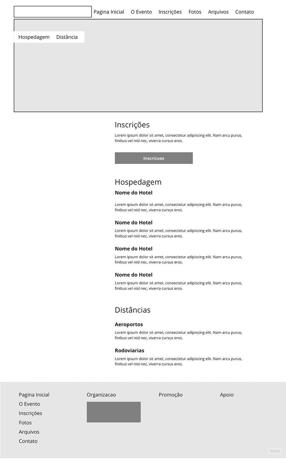
Some of the wireframes produced

sketches-wireframes

Homepage Wireframe
News page wireframe
Wireframe of the event's page
wireframe of the registration page

User Interface

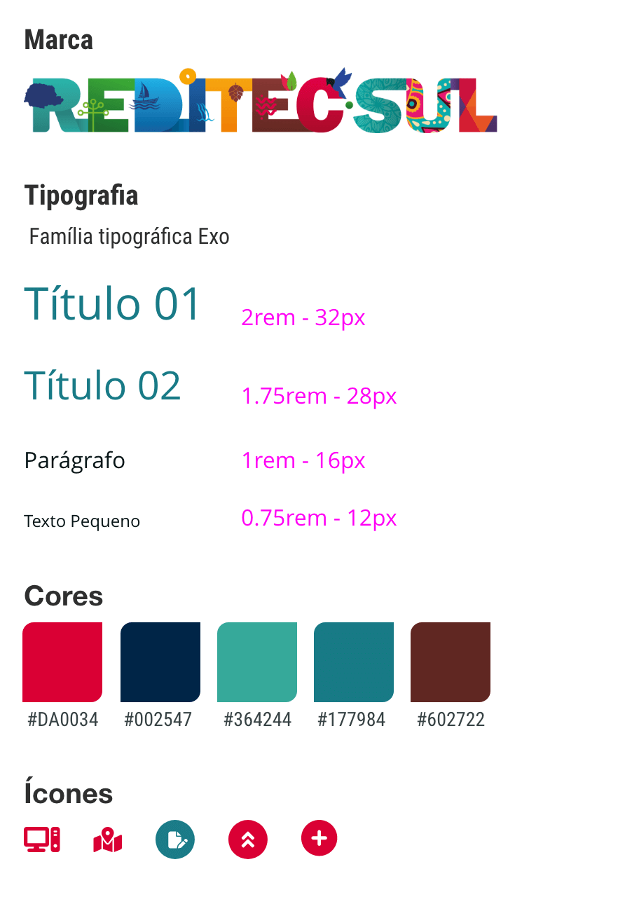
For the user interface, besides the information architecture structure and the wireframe, I defined the basic style guide for the visual inferface. They were based on the visual identity of the event. The color palette, typography and style of the graphic design were derived from the brand and visual identity. The use of alternating straight and curved corners in the event's brand inspired the use of this design feature in some of the interface elements.

ui-images

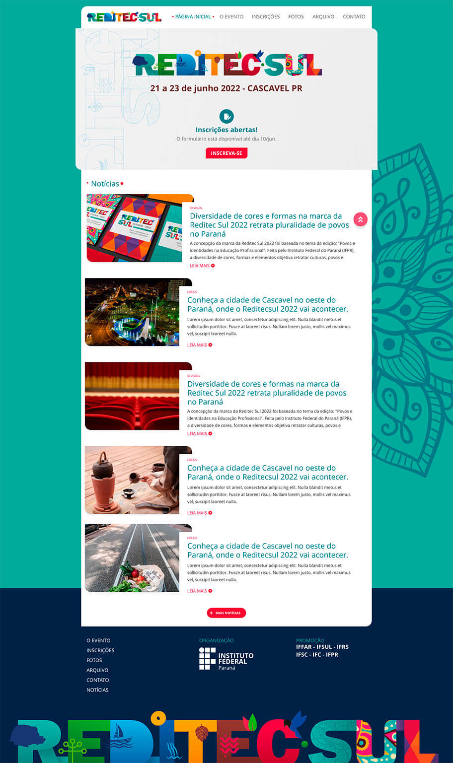
final graphic conception of the site's homepage
Styles guides used in the development of the site's graphic concept

Prototyping and Usability Testing

With the definition of the user interface, I built the pages in Adobe XD and we were able to test the prototype with users. We recruited users from our institution with profiles similar to the site's end users and asked them to perform the tasks that the event attendees would perform on the site. After the tests, we made the necessary adjustments and arrived at the version to be implemented in code.

Final Product

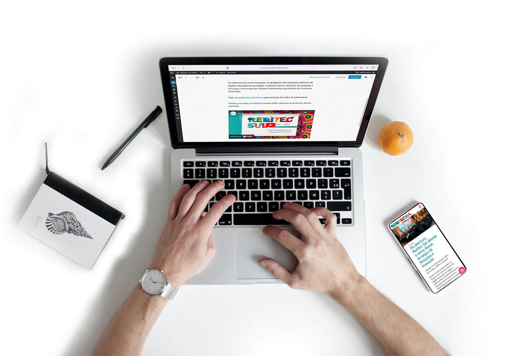
One of the necessary functionalities for the site would be that the journalistic team could edit and publish news and photos of the coverage.Thus, it was necessary to build the site on a platform that would allow access control and provide editing and publishing tools. As the journalistic team already works with Wordpress in our institutional portal, we opted to build a Wordpress theme adapted to the graphic project we had developed.

Results

The Reditec Sul website was made available on May 02, 2022, providing access to registration and key information about the event. During the period of the event, from June 21 to 23, the team produced and published the news, photos and videos of the journalistic coverage. After the event, users also had access to the link to issue certificates through the site. The site brought together information about the program, the event, and the city that hosted this edition. The user also had access to information about lodging and travel options to the city and places of the event.

Evaluation

The participants who answered the evaluation form gave the site a score of 9.8 (scale of 1 to 10). The following are evaluations of the results and impacts of the site, made by some of the participants involved in the organization of the event.

Testimonials

The site looked very nice and its structure was very well solved: in a few clicks, users could find what they needed, either to register or to consult general information about Reditec or the city where the event was held.
Erik Feitosa - IFPR's Communication Director

The site was and is an excellent concentrator of information for the success of the event, without a doubt the tool brought excellent results. Both on the cell phone and on the computer, the information is available in an easy way to find and visualize, information such as the geolocation of the event and the hotel contacts were a facilitator for the participants from other states.
Sidnei Batista dos Santos - Head of Office of the Director of IFPR Campus Cascavel

I believe that the website positively impacted the event. Firstly because the layout allows the participant to feel the atmosphere of the event through the well applied visual identity. Another point is the good usability, which provides quick access to content, facilitating the efficient dissemination of the event.
Fernanda Sartor - Public Relations IFPR

I think the website was efficient in promoting the event and its brand, as well as facilitating the participants' access to information, news, and other content produced during the event.
Naiara Longhi Maia - IFPR Journalist