Based on the user flows and use cases presented, I built the graphical solution for two pages. The home page where the user has an idea of all the options of the support, and another page model to present specific information about each coffee maker.
For simplicity, I divided the presentation of the graphical solution into the two use cases defined above.
Section 1: Users search for the information
Coffee Machines Support Page
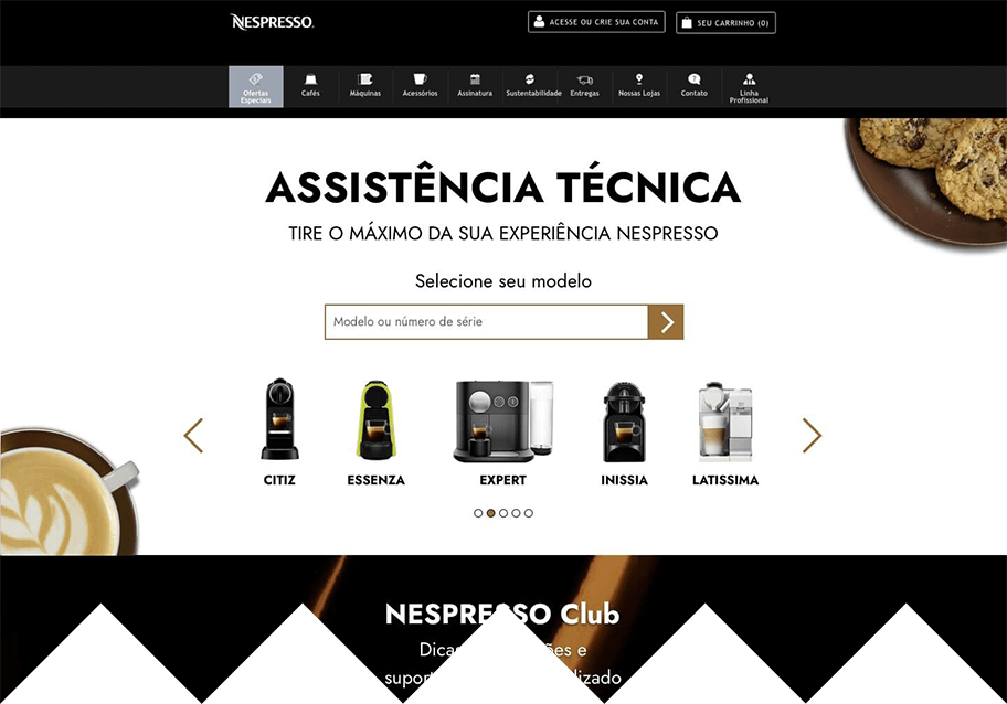
Screen 01
The top section is for users that want to find information about the machines themselves. The critical step for this user is to select the correct machine model. For this reason, most of the background is plain white to highlight the machine models for selection.
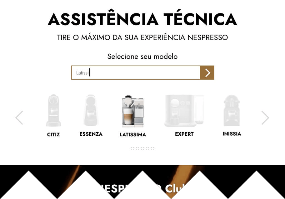
Screen 02
Once the user starts to write in the text input, the carrousel with the machine models should bring to the center the models that match the term and at the same time greys the others models.
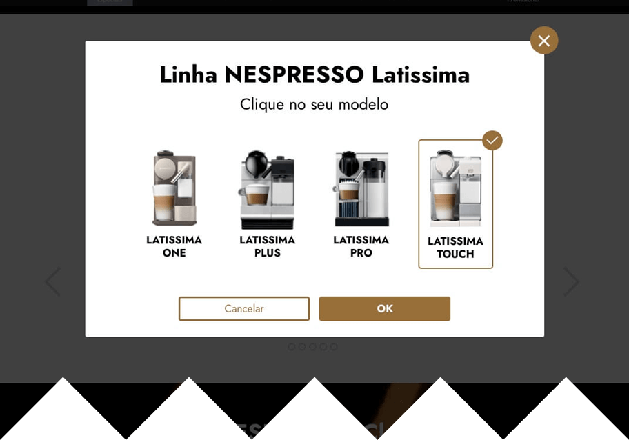
Screen 03
When a coffee maker has more than one model, a modal (pop-up) shows the options for the user choose from.
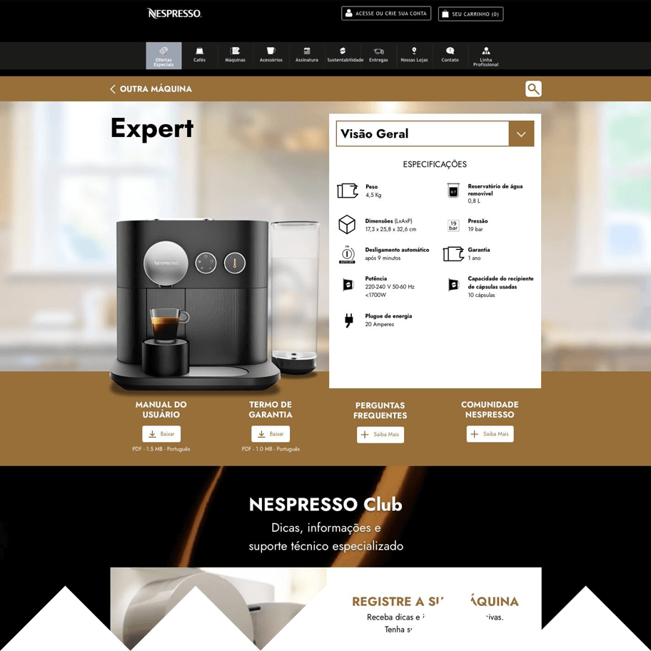
Coffee Machine Page
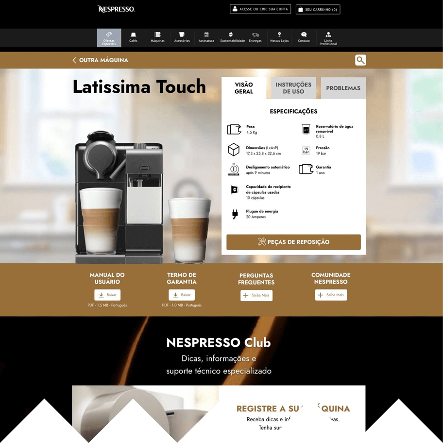
Screen 04
The coffee maker page has two sections. The top part has general information about the machine, while the second has specific information. The photo is highlighted so that the user can confirm that it is their model.
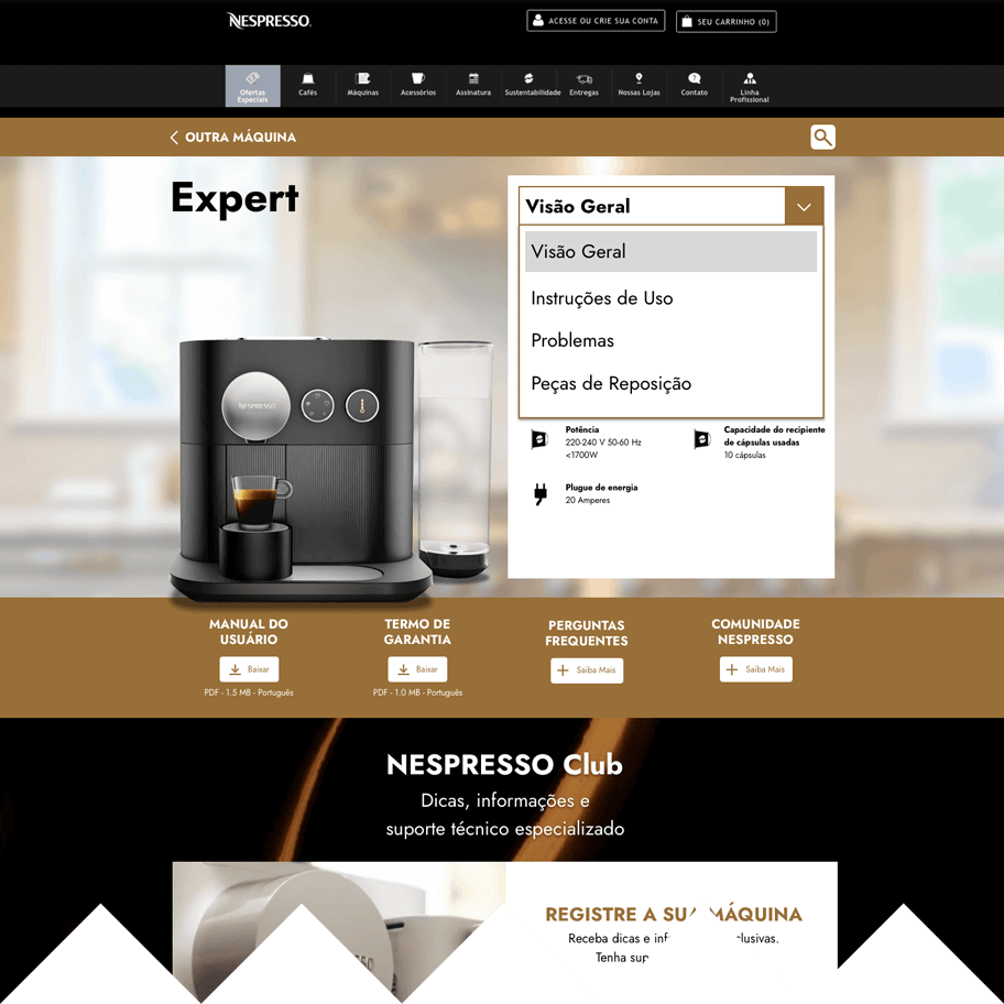
Changing the navigation method
Screen 05
To make more room for a wide coffee maker picture, I changed the navigation on the component containing the machine information from tabs to a drop-down menu.
Screen 05a
The drop-down menu is more flexible, as it can show more items within the same layout structure. Thus, navigation is not restricted to just three items.
Section 2: Users wanting to contact the customer support channels
Screen 6
The customer support contact channel information is in a single space, called Nespresso Club. This area also has information about machine registration and exclusive services for Nespresso customers. This section is displayed on every support page, the customer can access it at any time.
